Color in Art
Let's examine the role of color in art! This page will focus on the important role of color in abstract art. Along with form, line, texture, pattern, composition and process - color is one of the tools that artists use to create effective and meaningful abstract artwork. There are some paintings whose entire meaning is wrapped up in color!
Color in art is a vast subject worthy of exploration. You've probably noticed that different colors affect your emotions, either consciously or subconsciously. A bright red painting will affect you differently than a cool blue painting, for example. Look at the two abstract artworks below and compare how each one feels to you:

Study For Homage to the Square
Josef Albers

Shadows I
Warhol, Andy
Do you feel more energized by the image on the left? Does the painting on the right make you feel calm and sleepy?
The reason these two artworks effect you differently because each color has its own vibration, similar to how each sound has its own wavelength. Many traditions and cultures, such as Chinese, Ayurvedic, Theosophist, and ancient Greek and Egyptians believe in the healing power of colors, based on the effect their vibrations have on the body and mind. Kandinsky, one of the first abstract painters, was keenly interested in color in art and developed many theories on the properties of color in art and how they are best used.
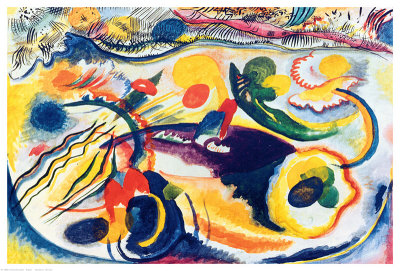
On the Theme of the Last Judgement
Wassily Kandinsky
An artwork will create very different energy depending on whether it contains all one color, a few colors, or many colors. And then the type of energy they emit will depend on what exactly those colors are. For example, a monochromatic painting that contains seven different tints and shades of off-white will look and feel entirely different than a painting that has the exact same composition, but is painted with every color of the rainbow.
When looking at an abstract painting, examine how the color combinations play off one another, and in turn how they effect us as viewers. For instance, a large green painting will suddenly look different if a red dot is added in the corner. Just one little smudge of paint will change the entire meaning and composition of a piece. Another thing to look for in abstract art is whether there are equal amounts of each color, or if one color is predominant.
A good example is the work of color field painter, Mark Rothko. These paintings are all based on the color red. Notice what a difference it makes in composition when he adds white and red. These differences are fairly simple, but the effect is profound.

No. 3
Mark Rothko

Red, White, Brown
Mark Rothko

White over Red
Mark Rothko

Brown and Black in Reds
Mark Rothko
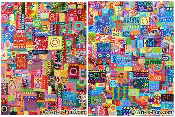
Take a look at the two different paintings below. They were painted in the same abstract style, using the same colors. However, they are slightly different. The one on the left has more green hues, and the one on the right has more yellow hues. How do these paintings "feel" different from one another? If it helps, use your hand to cover up one of the paintings while you examine the other one. Then, switch and cover up the other painting with your hand. You'll see and feel the difference that color in art makes!

One has more green and one has more yellow.
Here is a similar example. The two paintings below are very similar in style, but the one on the left has more warm colors (yellow, orange, red, pink) while the one on the right has more cool colors (blue, green, purple). Again, cover up one of the paintings with your hand so that you can see them one at a time. When you do this, the color differences between them will become more apparent!
One has more warm colors and the other cooler colors.
a look at tone in abstract art
Tone is another important factor when considering color in art. Tone refers to how light or dark the color is. A painting with mainly light tones will feel softer than a painting with mainly dark tones. A painting with equal amounts of light, dark and middle tones will help the eye move around the piece, depending on where and how they are placed.
Here are two examples from two different abstract paintings. They are very colorful, but when they are desaturated (seen in black and white), it is much easier to see the tonal range in the paintings. You can see that the top painting has more dark tones, and the bottom painting has more light tones. Both of them have a pretty good tonal range.
examining tone in abstract art:

Keep these ideas about color in art in mind when you create your abstract paintings. Pay attention to the colors you use, where you place them, and in what amounts. Color is a powerfully expressive tool!

Click to return to the Abstract Art Table of Contents, where you can...

If you like my abstract art, check out my printable Abstract Coloring Book with 20 pages of intricate abstract line art to fill in with COLOR!