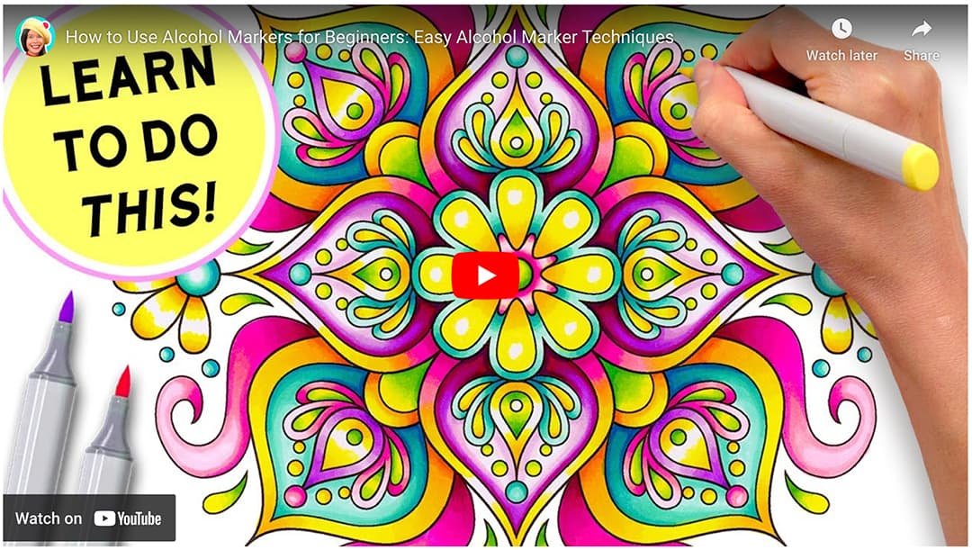
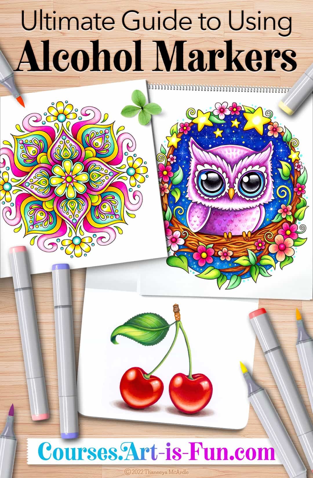
Alcohol Marker Techniques
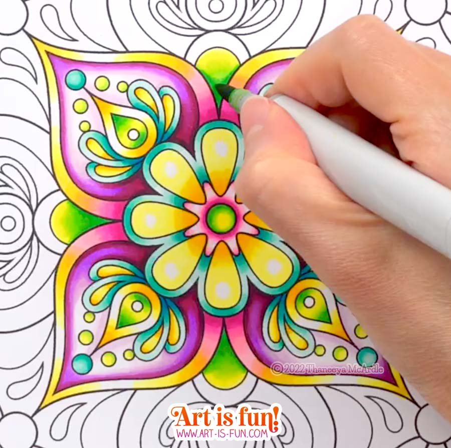
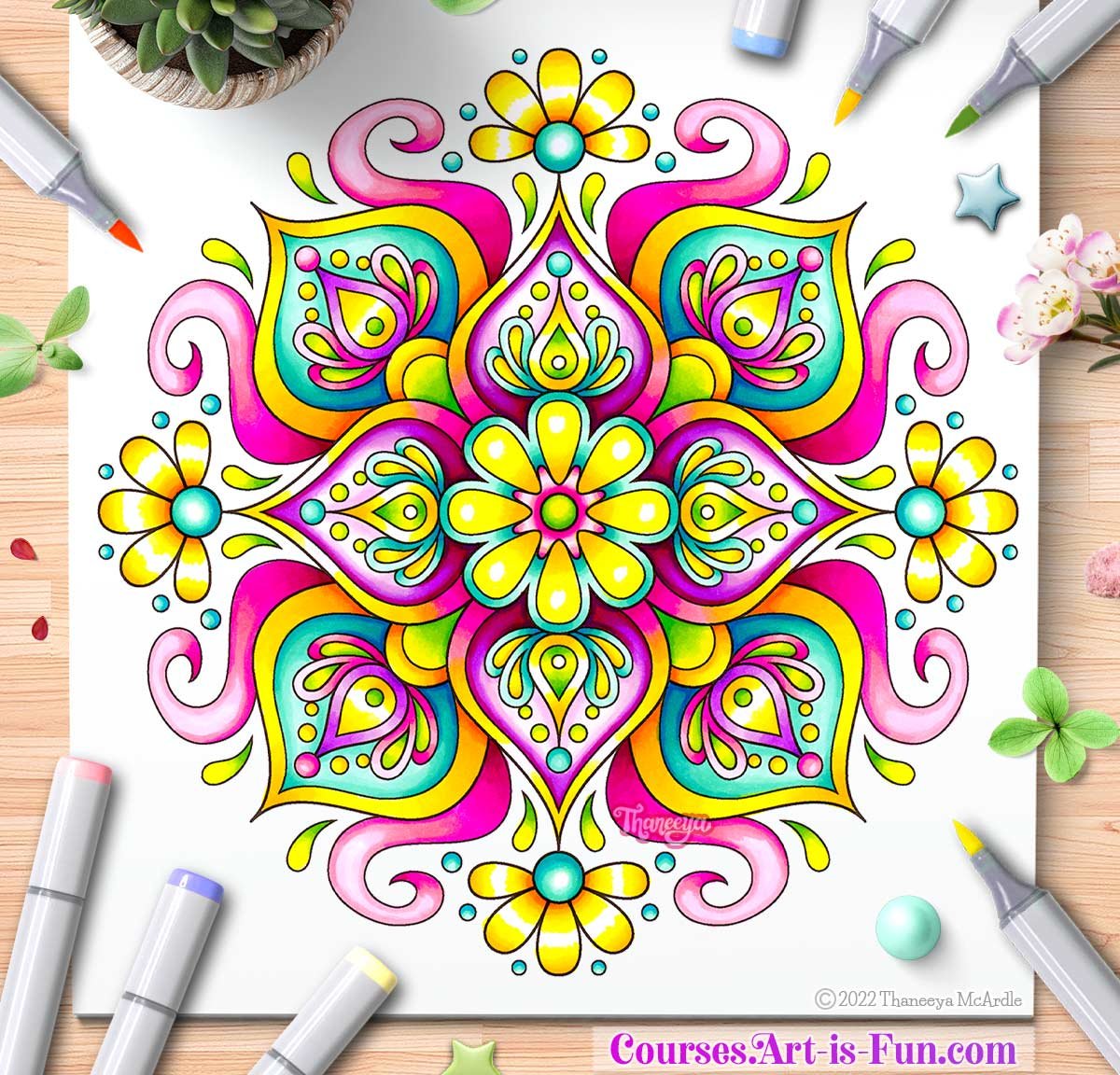
Learn easy alcohol marker techniques for creating eye-catching art! Follow along as I color in this luminescent mandala using alcohol markers:
If you enjoyed this video, be sure to subscribe to my channel so that you never miss a thing! 😍
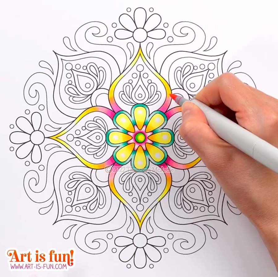
I colored in this mandala using Copic Sketch Markers on X-Press It Blending Card (affiliate link). Creating smooth, seamless blends with alcohol markers is a lot easier if you're using paper that is specifically designed to be used with alcohol markers. You can certainly blend on other types of paper, like card stock (as I did for many years), but for the smoothest experience, I highly recommend using an alcohol marker paper. X-Press It Blending Card is an absolutely wonderful paper for blending alcohol markers!
On this page, I’ll highlight a few of the tips that I shared in the video above.
Tip #1
Blend to White
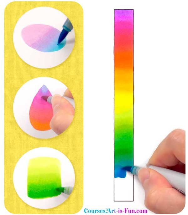
Blending from a color to white is one of the easiest things you can do to create luminescent blends with alcohol markers! When the white of the paper shows through, it creates a striking sense of vibrancy in your art.
I’ve blended to white in several sections of the mandala below. See if you can spot them! It’s a subtle technique that can be quite effective.
Tip #2
Blend together colors from different color families
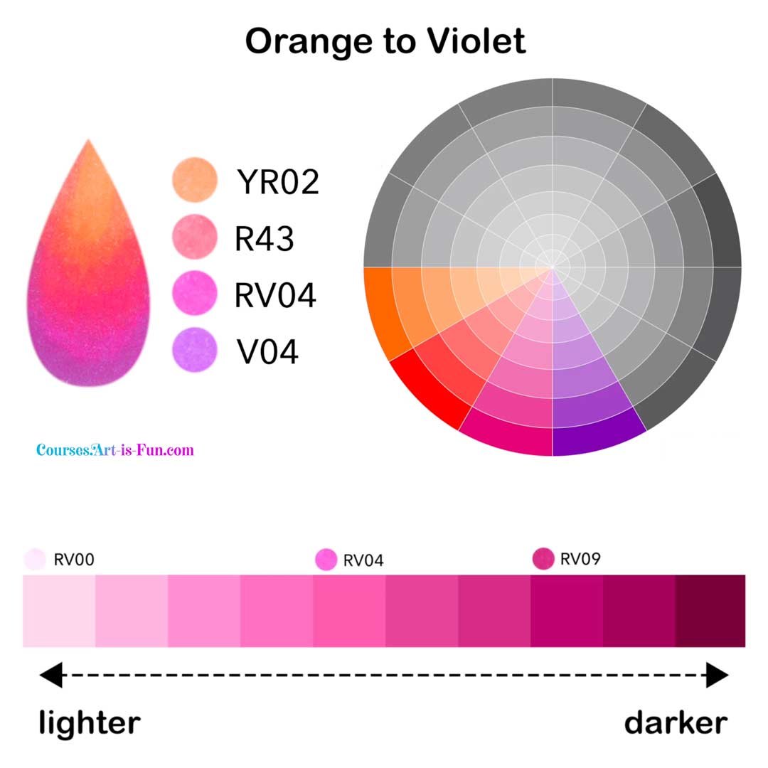
When people first learn how to use Copic Markers, they’re often taught about “Copic blending formulas” or “Copic blending rules”, which basically involves blending together colors that share the same letter and same first number. I’m not a big fan of these rules because the results are often boring compared to the results you can achieve when you don’t follow those rules. 😉
In my experience, your blends will look MUCH more dynamic if you blend together colors from different color families.
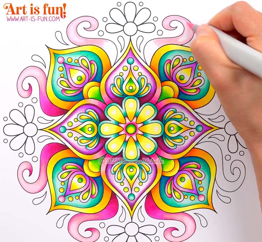
Above, you can see an example of that in the long pointy sections where I blended from yellow to yellow-orange to red-violet. In the center circle, I blended from yellow to yellow-green, as I’m also doing in the close-up below.
Tip #3
Blend to darker colors to create depth
Even though this mandala is a completely abstract artwork, you can make it look more eye-catching by creating a sense of depth and dimension.
In the screenshot above, you can see that the shape I’m coloring is lighter at the top and darker towards the bottom. This makes it look like the shape is “tucked under” the 2 shapes on either side of it. This is a very easy trick to make your art look more dynamic, no matter what the subject matter!
Below, you can see that I’m doing similar thing with the blue-green shape. I created a sense of shading to make it look like it’s in the background, with the smaller shapes on “top” of it.
Tip #4
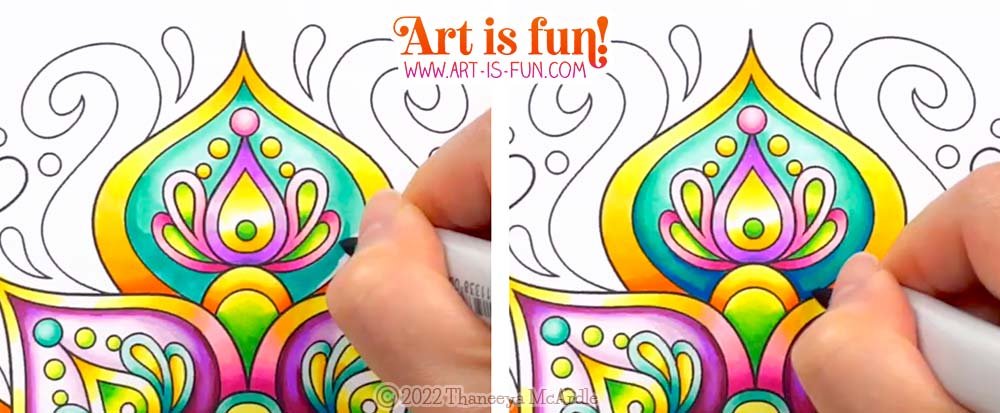
When in doubt, blend from light to dark
The benefit of blending from light to dark is that you can always go darker. This means that you can experiment with exactly how dark you want to go, and get there gradually, rather than accidentally going too dark right from the start and then regretting it. In the side-by-side example above, you can see that I gradually made the blue-green area darker, assessing it as I went along until I was happy with it.
Some people swear by blending from dark to light, and while it’s an equally valid technique, BOTH techniques are perfectly fine. Neither is right or wrong or better. It’s ultimately up to you and which way you prefer. I recommend trying both ways (blending light to dark and dark to light) and seeing which way works best for your artistic needs!
Just be aware that the danger of blending from dark to light is that if you accidentally go too dark, it can be really difficult (if not impossible) to lighten that area, without it looking weird. Just something to keep in mind.
Tip #5
Color in similar areas at the same time
When coloring in mandalas, it can be really handy to color in similar areas at the same time. You can see I’m doing this for the long swirly shapes in the screenshot above. This reduces the number of times you have to switch markers.
Just keep in mind that alcohol markers blend more easily when the ink is still damp, so you don’t want to color in too many sections at the same time. If you work on too many areas at once, the ink might dry out, making it harder to blend smoothly.
In the example above, coloring in 2 of these shapes at the same time worked out well, because the ink remained damp for both shapes while I worked on them. If I’d worked on all 8 of those shapes at the same time, the 1st shape might have dried out too much by the time I got to the 8th shape.
Tip #6
Reuse the same colors throughout your artwork
One really easy way to create a sense of harmony in your artwork is to reuse the same colors (and color blends) throughout your artwork.
In this mandala, I used the same yellow-orange blends, blue-green blends, pink blends, and yellow-green blends throughout the artwork. This results in a pleasing sense of consistency.
Depending on your subject matter, this may or may not be fully applicable, but it’s something to keep in mind. 😊
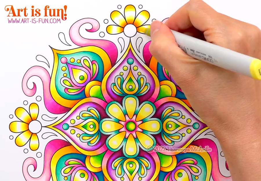
Below you can see the finished mandala!
I hope this video and these tips were useful to you! 😃
If you’d like to learn alcohol marker techniques more in-depth, this mandala is just one of many lessons you can watch in real-time in my Ultimate Guide to Using Alcohol Markers. I devote 90 minutes to coloring in this mandala, divided into 7 narrated video lessons in which I explain what I’m doing, and why.
Printable line art is included, along with Color Swatches and Color Names, so you can follow along with me, at your own pace! You can watch my techniques from different angles, so it’s like you’re in the room with me, looking right over my shoulder!
My Ultimate Guide to Using Alcohol Markers also includes lessons about Blending Theory, so you can gain a solid understanding of which colors to blend together, outside of the typical (and often boring) “Copic blending formulas” that I mentioned earlier. We’ll explore the color wheel and the power of blending analogous colors, as you can see in the screenshot below!
If you’re a total beginner, my Ultimate Guide to Using Alcohol Markers is perfect for you! We’ll start right at the beginning with basic blending techniques, and gradually build your skills until before you know it, you’re creating beautiful rainbow blends! 😍
There are many more goodies included, such as 50+ pages of downloadable resources, such as custom color charts and more! Click here to watch the course trailer and see everything you’ll get in this course! 💖
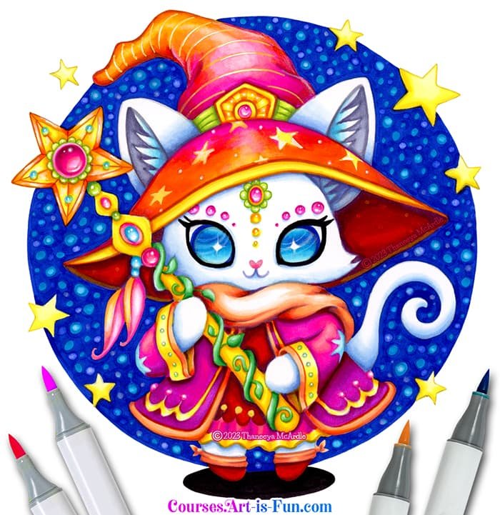
Wizard Cat Coloring Course
If you love cute, colorful art, join me as I demonstrate how to color in the adorable illustration below! 😍 In my Wizard Cat Alcohol Markers Course, I’ll show you step-by-step how to use alcohol markers to color in this kawaii cat. Printable line art is provided, along with color names and swatches, so you can easily follow along with me. Expand your range of alcohol marker skills while creating vibrant, eye-catching alcohol marker art!
Keep Learning!
Head back to the main Alcohol Markers Table of Contents
Learn more about Copic Markers
If Copics are out of your budget, check out my recommendations for best Copic alternatives
Check out more fun alcohol marker tutorials!
Visit my YouTube channel for more alcohol marker videos!
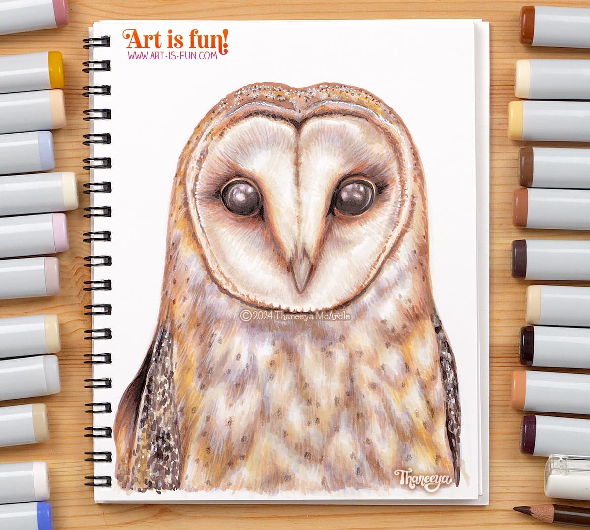
Draw Realism with Alcohol Markers
Learn the best alcohol marker blending techniques for creating realism, as I demonstrate how I drew the owl below!
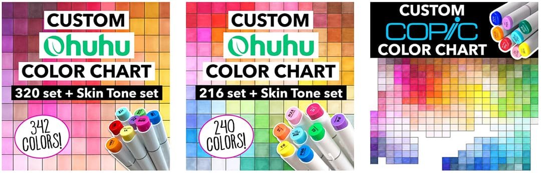
Custom Alcohol Marker Color Charts
My custom color charts for Copic and Ohuhu make it easier to choose colors for blending, because arranged the colors chromatically, placing similar colors next to each other!